SHURE · 2015 — 2019
Microflex Complete Interpreter Console
Redesigning the conference interpreter console for the European Union — and changing how Shure designs hardware
UX designer on Shure's first major hardware project to be led by user research. The redesigned console shipped as part of the wired MXC system and is deployed at the European Union and other government venues.
What an interpreter console does, and why it's hard to design for
Conference interpreters work in soundproof booths at the edge of legislative chambers and corporate venues. They listen to a speaker in one language and translate live into another, working 30-minute shifts because the cognitive load is too high to sustain longer. Their tools must disappear into the background.
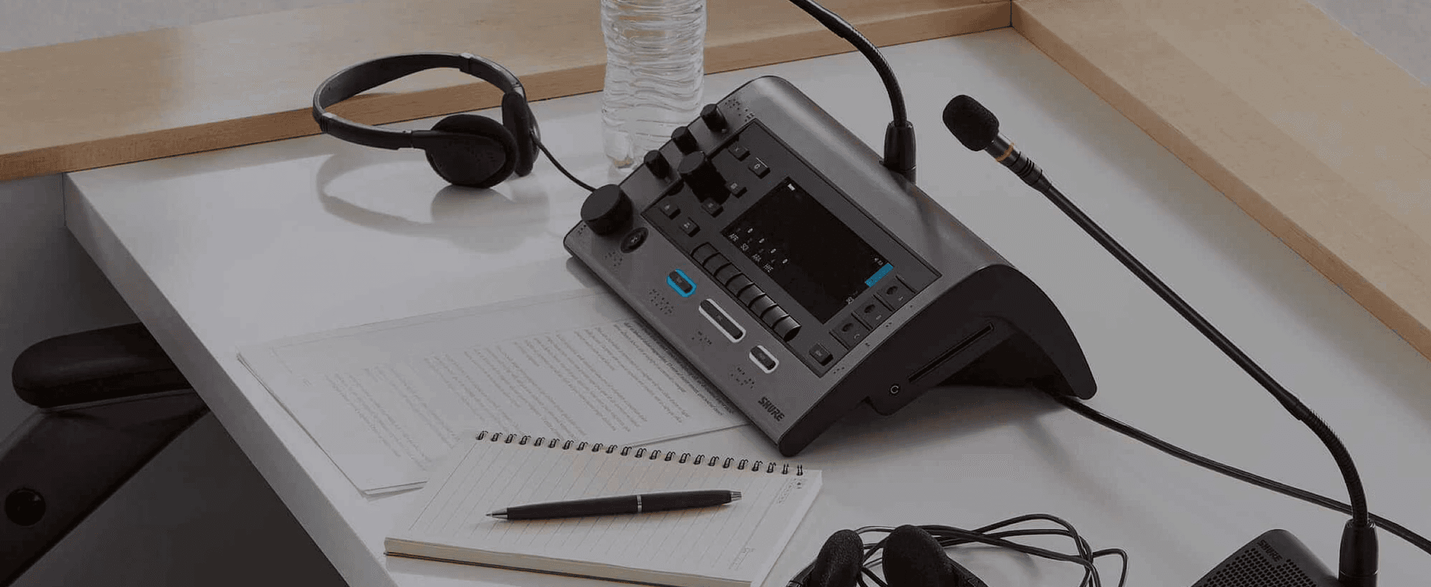
The interpreter console is the physical device on the desk in front of them — small, non-touchscreen, irregularly shaped, operated largely by feel while the interpreter listens with their eyes closed. Many interpreters are visually impaired; most sighted interpreters effectively work eyes-closed. Visual UI changes that don't communicate through tactile or audio feedback fail this population entirely.
·
An admin web app
for the IT or AV technician who installs, configures, and monitors the system
·
A charger status display
for tracking which microphone units are charged and ready
·
A touchscreen on the microphone unit
for the meeting chairman, who controls voting, agenda, and speaker order
·
A different touchscreen UI on the same unit
for delegates, who participate in the conference
I joined the project in 2015 as UX designer, working with an Industrial Designer, three Engineers, and three Product Managers. Two non-negotiable constraints framed the work: comply with the ISO 20109/20108 standards governing simultaneous interpretation equipment, and don't break interpreter habits built over decades. ISO compliance is prescriptive — button layouts, icon vocabularies, and physical key positions are largely specified. The interesting space was in what ISO didn't specify.
Researching with interpreters at the EU Parliament
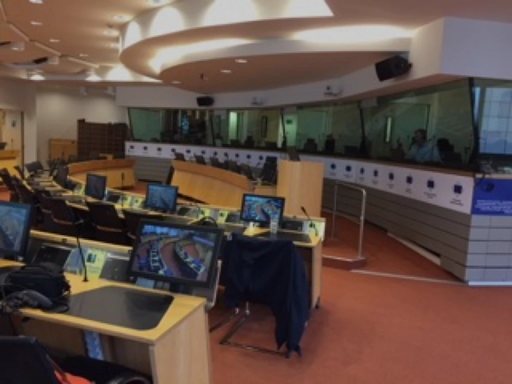
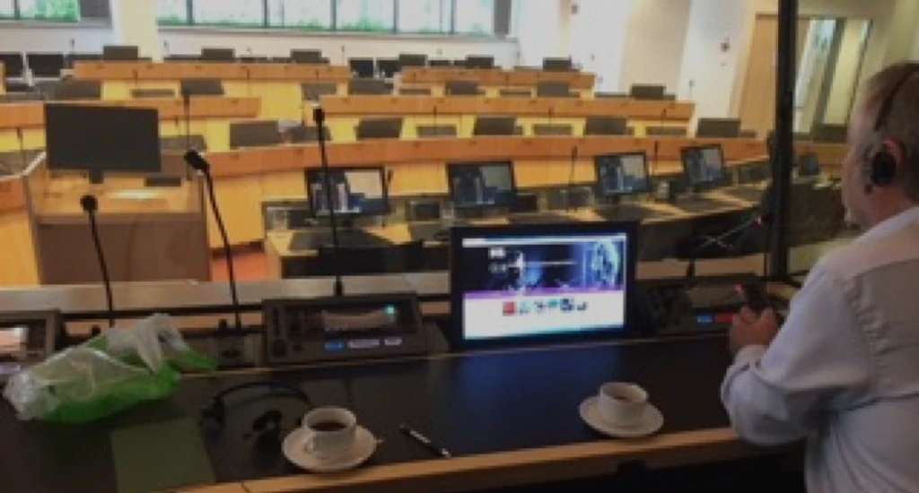
The user research nearly didn't happen. Interpreters work mid-session and can't be interrupted; ISO compliance meant access was tightly controlled. Through introductions from one of the ISO committee members who also worked as an interpreter, I conducted on-site research at the EU Parliament in Brussels with a group of professional interpreters between live sessions, using working prototypes of the redesigned console. The research session reshaped the design.


Research with EU Parliament interpreters between live sessions. Booth from outside (left) and view from inside (right).
FEATURED DESIGN DECISION
Replacing four buttons with one rotary encoder
The biggest open design question was how interpreters would navigate between functions on the small irregular screen. The original industrial design proposed four soft-keyed buttons running down the left side of the screen, each labeled by an icon on the adjacent UI region.
I prototyped this and found three problems.
The buttons didn't refresh.
When users navigated between pages, the function of each button changed — but the physical button itself didn't communicate the change. Sighted interpreters in dim booths had to repeatedly check the screen to remember what each button did. For blind interpreters, this was a complete failure: they would have to memorize button functions across every screen state.
Screen real estate was scarce.
Four labeled buttons on the left consumed roughly 20% of the already-cramped screen.
Navigating 90+ languages with soft buttons was slow.
Selecting from a long list using stateful up/down/select soft buttons required too many discrete press-and-release actions. Interpreters need to set languages in seconds.

Original · Four soft-keyed buttons
Shipped · Single rotary encoder
The shipped design replaced four soft-keyed buttons with a single rotary encoder modeled on a car radio. The encoder solved three problems at once.

Wireframe recording that shows the interaction for setting the language for one an input-language channel
I proposed replacing the four soft buttons with a single rotary encoder modeled on a car radio: turning scrolls, pressing selects. Familiar mental model from any vehicle dashboard in the last thirty years. The encoder solved all three problems at once.
The physical input stayed the same regardless of context — users learned one input device, not a stateful button set. The freed screen space went to content. Selecting from long lists became a single continuous scroll-and-click motion.
I designed a navigation bar that reused the icon column on the left side of the screen for navigation between high-level screens, and added a dedicated back button just above the encoder for multi-level navigation. The redesign also surfaced new opportunities. Settings screens that needed quick adjustments to a single value — headphone volume, screen brightness — used the encoder for both selecting which value and adjusting it. A single-input interaction interpreters could perform without looking at the screen at all.
What happened
·
Shipped as part of the wired MXC conferencing system
and deployed at the European Union and other government venues.
·
First Shure hardware project where design influenced the hardware itself.
Before this project, design contributed UI for hardware that industrial designers and engineers had already specified. The interactive prototypes I built demonstrated that the rotary encoder decision required physical changes to the device. The hardware was modified to match the design. The process precedent carried forward: subsequent Shure hardware projects gave design input into industrial design and physical controls earlier.
What I learned
I joined a team where I was the first designer most members had worked with. Early critiques were unhelpful — comments like 'I don't like it' with no rationale.
I learned that design leadership in engineering-heavy organizations is partly the work of teaching the team how to evaluate design. I documented rationale for every significant design choice, tied each decision to user research findings or ISO requirements, and presented prototypes that demonstrated the alternative paths I'd considered. Over the project's four years, the engineering team's critique vocabulary shifted. By the end, the same engineers who'd started with 'I don't like it' were saying things like 'this conflicts with the encoder pattern from page 3.'
The biggest lesson: the case for a design decision has to be made before the decision is challenged, not after. Documentation isn't bureaucracy; it's how design wins arguments in rooms where design isn't the dominant culture.
Next case study