Horizon Planner
Designing the canonical AI capacity experience at Meta
META · 2022-2026 · LEAD designer
How my scope grew
There were three phases, and each phase came from hitting a feature set ceiling in the one before it.


The problem
By 2022, capacity decisions spanning years and billions of dollars were made across half a dozen disconnected tools, with planners assembling the picture by hand. The fragmentation produced predictable failures: decisions on stale data, long-range plans drifting from operational reality, and teams unable to trust numbers they couldn’t trace.
The tool had to serve three audiences without splitting into a user mode and an expert mode. ML engineers open it a few times a quarter to ask whether their team will get the capacity they asked for. Capacity planners live in it daily. Infrastructure leadership opens it to ask whether the plan is credible and what needs a decision today.
My role and the team
I was the sole product designer from concept through launch, partnering with a rotating group of four to six engineers depending on phase, and over the project I onboarded two more designers and five engineers into the AI infrastructure space.
A few decisions shaped the surface most, across two of its phases.
PHASE 2 | ORG-WIDE LIVE CAPACITY
Before this surface existed, an ML engineer’s only view into scheduling was one tab on the job page. It was thorough about a single job: priority, the GPU types it requested versus used, the full submit-to-complete timeline, and a per-region table of data and GPU availability. It even let owners reorder their own queued jobs. But it was scoped to one owner, so 1) it never estimated when a job would actually run and 2) reordering your own jobs changed nothing when several owners contended for the same tenant node. Phase 2 replaced it with an org-wide, real-time view of the whole tenant tree, so contention became something you could see and act on instead of guess at.
Information-architecture revamp
The org-wide view first shipped with an IA that mirrored Meta’s internal data taxonomy and adoption plateaued around 2K monthly users. Six months of research later, its three most decision-relevant components (live quota usage, capacity spenders, and the tenant job queue) sat two and three levels deep or below page fold. I rebuilt the IA around the three audience questions and A/B tested it against the existing pattern over six weeks:
+242% clicks · Live Quota Usage card
+64% clicks · Capacity Spenders card
+39% clicks · Tenant job queue
Adoption rose from 2K to 3.2K monthly users in the next two quarters, a 60% increase. This is the decision I’m proudest of, because it required convincing leadership to fund a six-week test against a pattern that was already adopted.

The redesigned home with promoted Live Quota Usage and Capacity Spenders cards. The tenant job queue is surfaced as a prominent tab.
Designing toward an insight
Capacity Spenders is the clearest example of designing a surface toward an insight rather than a metric. The obvious version ranks owners by one number. But the call a capacity manager actually faces is hidden in the gap between two numbers, because the biggest consumer of GPUs is often not the biggest driver of cost. So the card pairs GPU count against operating expense in the same row, ranks by whichever you choose, and grays the other back so the divergence stands out in the resting view. The deeper cuts by GPU type, job, and project would have crowded the surface, so they wait in a hover card that opens only when an owner is worth investigating.

Capacity Spenders on hover: the GPU-type breakdown shows why the top GPU user isn't the top spender. Interactive prototype.
Cutting a control to match the system
A control that looks live but does nothing has to go, because a misleading surface costs more than a missing feature.
The job-reordering control from the old tab was already limited, and partway through Phase 2 a change in the underlying scheduler made it obsolete for genai tenants altogether. The buttons still rendered, but the system no longer acted on them. Engineering’s default was to leave the control in place, since pulling shipped UI is work and the buttons seemed harmless. I pushed to remove it, because a control that claims to do something it no longer does is not harmless. It quietly tells an engineer they can influence scheduling when they cannot, so they 1) waste the minutes spent reordering before they notice nothing changed and 2) start to doubt the rest of the surface once they catch it lying. On a capacity surface, that second cost is the dangerous one, because the whole tool runs on engineers trusting the numbers in front of them. So the reorder control came out wherever the system had stopped honoring it, and the interface went back to matching what the scheduler actually did.
Making quota transfer safe to commit
When the same nodes are contended by more than one team, an engineer moves quota across the tenant tree, and reviews every movement before it commits.

The guided flow reads the 14-day demand forecast, flags the jobs that must be covered, and proposes the set of moves that covers them. The engineer can adjust any move before continuing.

Step 2 lists every individual movement with its source, amount, and return date, so the full consequence is visible before the transfer commits.
PHASE 3 | LONG-RANGE PLANNING
The AI-generated executive summary
The first version made leaders hunt for the decision; the redesign puts it up front.
The hardest moment in a capacity plan review is the first thirty seconds. The version I shipped initially had a generic Overview tab that tested poorly: leaders scanned for ninety seconds and asked their analyst the exact question I was trying to design away. The redesign replaced it with a summary that reads the current scenario and pairs the top recommended actions with the risks of delaying them.

Recommended actions and risks-if-delayed sit at the same visual level, so the trade-off is clear at a glance.
Natural-language scenario simulation
The hard part wasn’t parsing plain English, it was getting planners to trust the interpretation before they acted on it.
Capacity planning is a what-if discipline. I designed a natural-language interface where users describe the test in plain English, like “delay Singapore DC by 2 quarters.” The system parses the input and shows a Detected Adjustments preview the user confirms before anything changes. In post-launch research, planners went from simulating once a quarter to weekly.
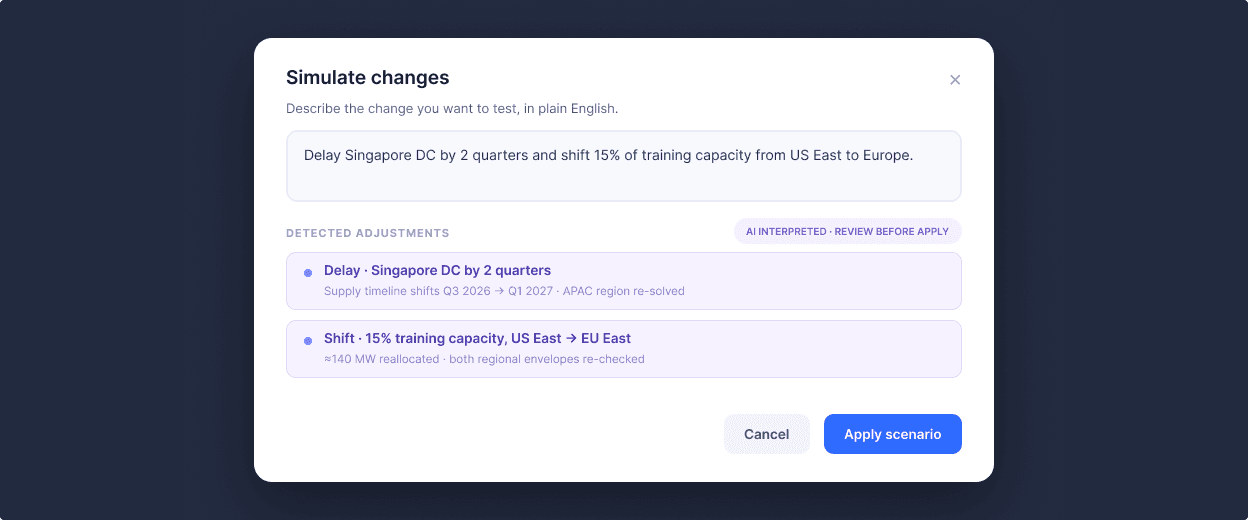
Filled state of the simulate-changes modal, with parsed adjustments shown before commit.
What I learned
Design leadership in engineering-heavy orgs is partly teaching how to evaluate design.
I made the case for each decision before it was challenged, and over four years the team’s critique vocabulary shifted from “I don’t think this is right” to “this conflicts with the discoverability principle we agreed on.”
Design for the question first and the data second.
The IA revamp wasn’t about better charts, it was about reorganizing the surface around the three questions every user was actually trying to answer.
AI features need verification scaffolding.
The simulation works because users verify the interpretation before committing, and the executive summary works because every claim drills into a KPI cell or chart. Trust in AI comes from exposing the reasoning, not hiding it behind a confident answer. Even without AI, technical users like ML engineers and capacity managers want to drill down into the minutiae of data and provenance.
Accessibility in dense data UIs is design from the foundation, not a layer added late.
I designed from the start with a color-blind-safe palette, redundant non-color encoding on every status indicator, keyboard-navigable grids, and icons where it made sense, with one rule above the rest: every chart had to tell its primary story even in grayscale.

The same forecast in color and rendered in grayscale: line weight, dash pattern, and markers carry the story without color. (Illustration purpose only.)
⚠ Screens shown are portfolio reconstructions with fictional data. Product names, financial figures, and internal references have been replaced. Design decisions, interaction patterns, and outcomes reflect the actual work.
Next case study: