A conferencing system for rooms from boardrooms to parliaments
SHURE · 2015–2018 · Sole UX Designer on project
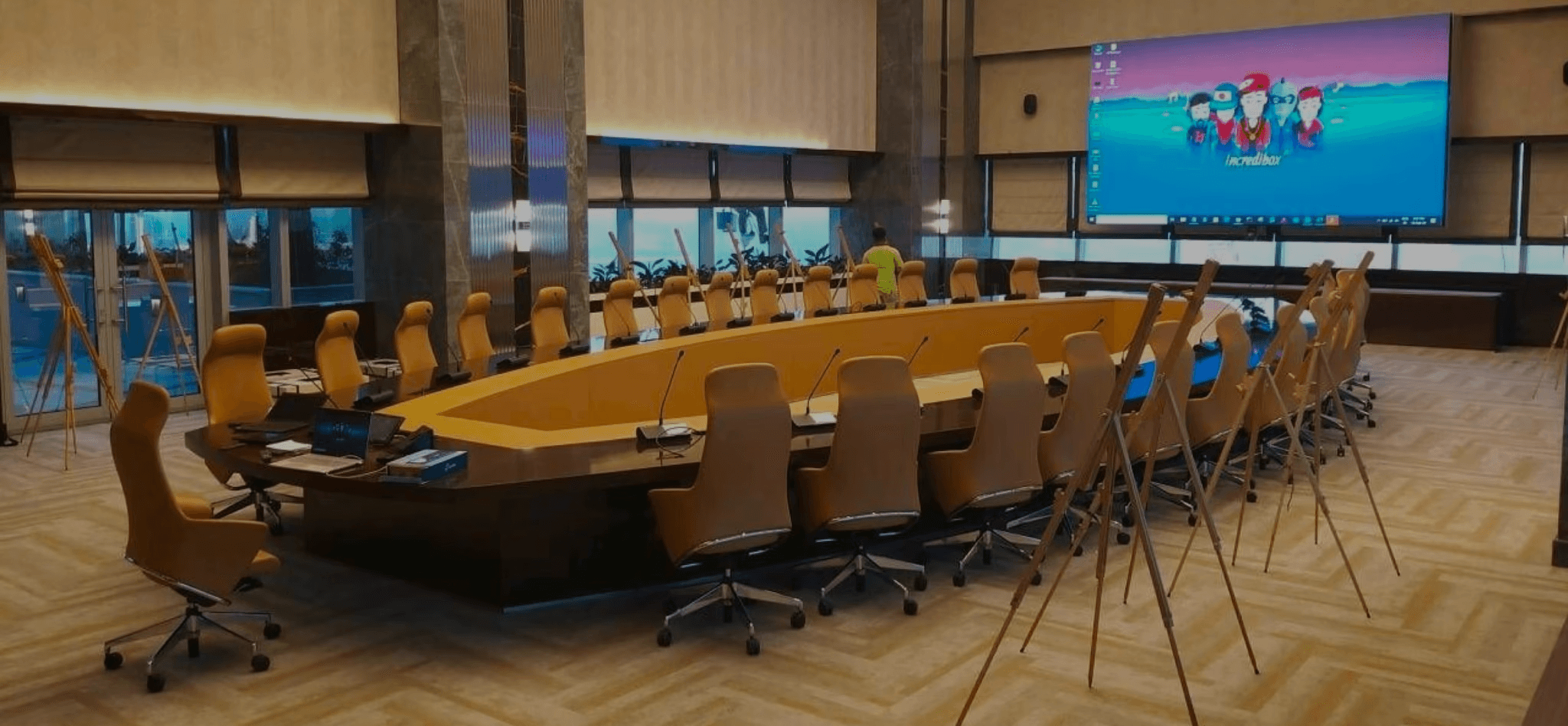
What we built
Shure entered the conferencing market in 2011 by acquiring a Danish company. By 2015 the inherited product was years out of date and customers like parliaments and universities were defecting. I joined as UX designer for the replacement: a wireless conferencing system across four connected interfaces.
• an admin web app for the technician who installs and monitors the system
• a charger status display for tracking which mic units are ready
• a touchscreen on the mic unit for the chairman, who runs voting and agenda
• a second touchscreen UI on the same unit for delegates
The same system had to serve a five-person executive meeting and a 500-seat parliament.
Why it was hard
The same microphone unit had to behave differently depending on who sat at it, with roles defined entirely in software on identical hardware. Voting screens had to handle 2 to 5 options, topics from one word to two sentences, and units shared by two delegates, every combination readable and tappable, and the touchscreen had to coexist with physical buttons without duplicating them.
Featured design decision
The voting screen layout
The hardest case was the Dual Delegate configuration, where two people share one unit and vote independently. I prototyped a vertical stack with a collapsible topic, and a horizontal layout with each delegate’s buttons on their own side. I shipped the horizontal one. The deciding factor was a context I’d missed: in most chambers the vote topic is already projected at the front of the room, so delegates don’t need it on their screen, they need fast button access aligned to where they sit.
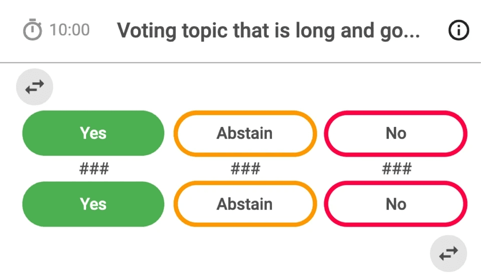
Variant 1 · Vertical stack with collapsible vote topic.
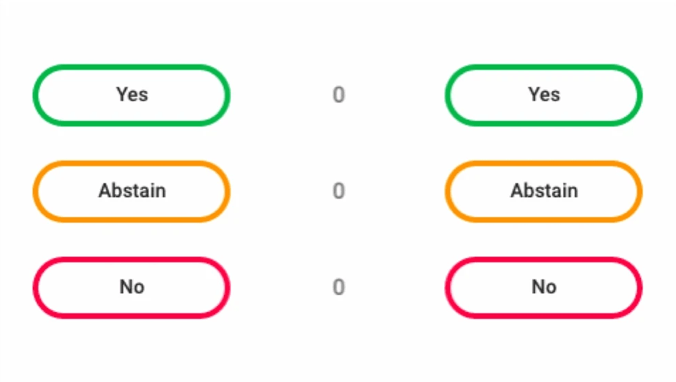
Variant 2 · Horizontal, spatially aligned with seated delegates (shipped).
• what was detected, in plain language
• the category of alert, so engineers could weight false-positive risk
• the specific job, its owner, and the time window
• two actions in the notification itself: Terminate and Investigate
Terminate was the controversial one. I argued the costs are asymmetric: a false-positive termination loses a few restartable hours, while a missed real issue can burn days of compute, so the asymmetry favors making termination easy, behind a confirm dialog showing the recent metric trend. The 22% early-termination rate validated it, because the system surfaced the decision when it was actually decidable.
Four surfaces, not one
I argued for four distinct interfaces on one hardware platform rather than forcing different users into a single surface. It turned out load-bearing: the admin app could be as dense as IT wanted because no delegate would see it, and the delegate screen could be as forgiving as we needed because no admin would.
What happened
Microflex Complete Wireless won Best of Show at Integrated Systems Europe 2018 and deployed in government chambers and corporate venues across Europe. The cross-functional design-engineering-PM triad I established replaced Shure’s sequential handoff model and was adopted by other teams.
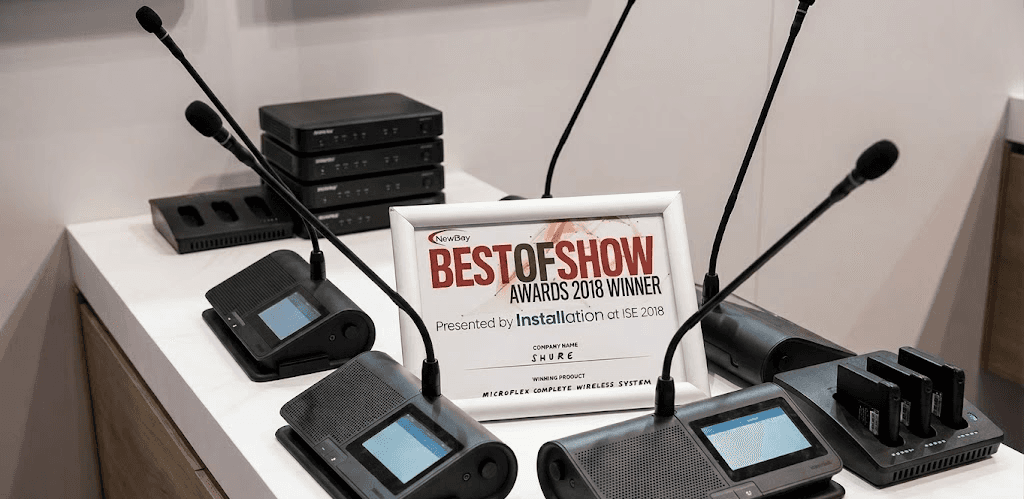
Best of Show award reveal at Integrated Systems Europe 2018, Amsterdam RAI.
Next case study: